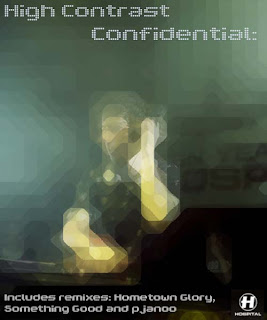
This is an advertising poster for high contrast's new album, done for the theme 'new music'.
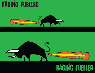
This poster is really a play on words, rather than rocket fuelled, its a 'raging fuelled' bull, with fire coming out of it.
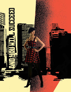
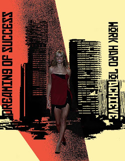
Here are two posters done in the style of Russian war posters, using the Russian font. They work well together as a pair and link well.
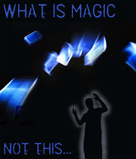
this was done for the magic theme and is supposed to show floating cards which do look like magic on the poster but really its not, which prompted the title 'what is magic, not this...'

The theme that this poster was centred around was heroes welcome. So I brought the three best known super heroes together. I made each hero into a graphic image and then lightened and darkened some areas which took a while to get right but I think I managed to get it right.
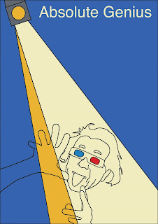
The title of this poster is genius, I had the original 3d glasses and raving hand gestures and thought it would be cool to add in Einsteins face as if he was raving in the spotlight. Thats why its 'absolute genius', Einstein raving.
.jpg)
This was the first poster I produced of a series of 10. We were given themes to choose from and base are posters around. The title of this one was 'broken' so i played around with this image of a women and called it 'broken women'.
 This is an advertising poster for high contrast's new album, done for the theme 'new music'.
 This poster is really a play on words, rather than rocket fuelled, its a 'raging fuelled' bull, with fire coming out of it.
 Here are two posters done in the style of Russian war posters, using the Russian font. They work well together as a pair and link well.
 this was done for the magic theme and is supposed to show floating cards which do look like magic on the poster but really its not, which prompted the title 'what is magic, not this...'
 The theme that this poster was centred around was heroes welcome. So I brought the three best known super heroes together. I made each hero into a graphic image and then lightened and darkened some areas which took a while to get right but I think I managed to get it right.
 The title of this poster is genius, I had the original 3d glasses and raving hand gestures and thought it would be cool to add in Einsteins face as if he was raving in the spotlight. Thats why its 'absolute genius', Einstein raving.
.jpg)


 This cover works really well for 'the case of the black eyed blonde', although I've changed the colour of this woman's hair its still clear she's a blonde and I think the red and black compliment each other well. The black of the facial features is very nice and defined as well as the cheekbone.
 This book cover was done for the title 'green for danger', and shows a soldier in a gas mask. I put in the fading green colour around him to act as green gas surrounding him.


 T
T